KiloJules wrote:
Don't want to burst your bubble here or anything buuut...
I don't see it. What's "new" about those letters? Why create sth. like this when there are already lots of very different ones available in any writer software? Who cares about fonts anyway?
I'll liken it to a wheel. At a first glance it is round and carries a car around. When you go deeper you will notice that the patterns on them differ, some have studs because of ice, and some have not pattern at all and are smooth. While you cannot re-invent the wheel as such you can make wheels for different situations where just that wheel will excel.
Why does anyone create anything? I did it because I wanted to make my own. Because no other typeface has the look that I want to have. So, why not make my own? Who cares about fonts is anybody in marketing, graphics design, or anybody communicating at all. If we all used the same font for everything then the world would be incredibly dull! CERN using Comic Sans to reveal Higg's is a good example! It is a serious matter and a more neutral font such as Arial or Helvetica would have suited it much better. Typefaces communicate feelings in written text, and that is why we should all care about it.
But overall, I care. That is enough for me.
EDIT: Here's a comparison. Imagine writing and publishing a book in Papyrus.
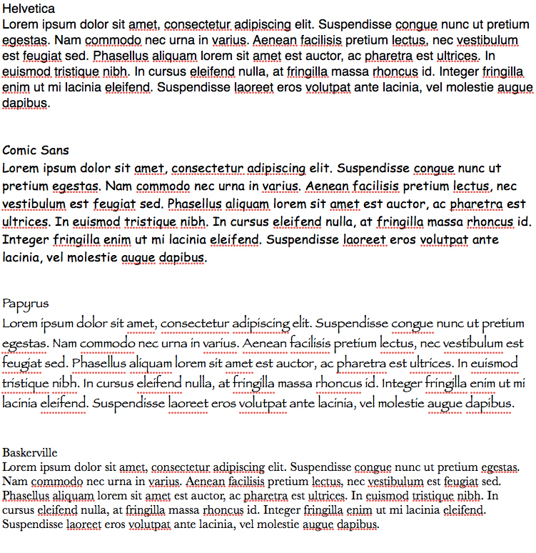
Or this 2-minute job:


Dogmaster(NL) wrote:
I miss the O in the alphabet
I forgot to click on it

Noticed this morning.


")


")


")


")


")